
Food Hall Design Essentials: What Actually Matters
The difference between a food hall and a food court is all in the design.
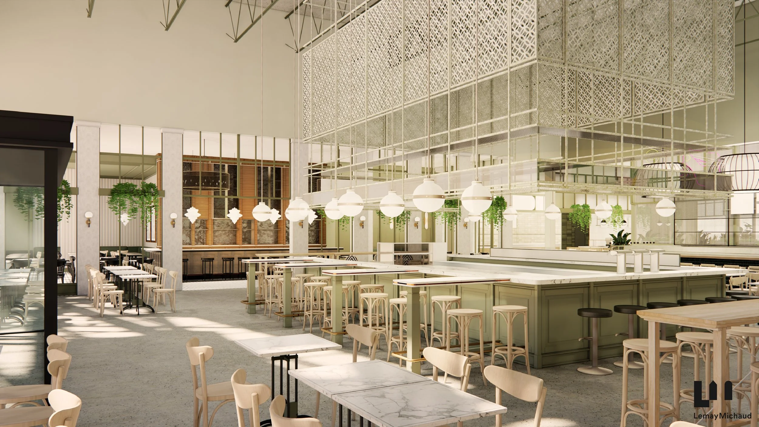
Le Fou Fou Food Hall, Montreal
The most consequential decision in food hall design is one that most developers don't recognize as a decision at all: whether the hall will feel like a real, cuisine-driven food hall or default to a food court with better lighting.
The difference isn't the operating model — plenty of managed multi-vendor venues get built and still fail to escape food-court territory. The difference is design. A food hall is date-night-worthy. A food court is somewhere you eat because you have a few minutes heading off to Macy's. A food hall has a cohesive visual throughline that binds the whole space together, so guests can absorb the room in a single moment and then explore. A food court is a mishmash of individual tenant signage screaming for attention. A food hall has furniture and finishes elevated enough that guests want to linger. A food court has those indestructible hard-backed chairs that are engineered to be uncomfortable after thirty minutes — because turnover, not experience, is the operating goal.
Every food hall design decision we're going to walk through in this post is really an answer to the same question: is this decision moving us towards a "destination dining experience" or towards a "cafeteria"? That's the frame. When developers hold that question in mind through the design process, the decisions get easier. When they don't, halls end up expensive and half-empty within eighteen months.
What is good food hall design?
Good food hall design is the intentional shaping of a multi-vendor dining venue so it functions as one coherent experience rather than a collection of individual tenants. The best food hall designs balance three things: scale appropriate to the trade area (big enough to feel exciting but not so big it feels empty), human-scale detailing (seating variety, signage legibility, absorbable visual hierarchy), and operational flexibility (built to accommodate the vendor changes and cuisine evolution that will inevitably happen over the hall's life). Every principle in this piece is really an application of one of those three ideas to a specific decision.
Size it right — big enough to be exciting, not so big it feels empty
The two most expensive design mistakes in food hall development are, in order: sizing to fit the available square footage, and under-programming the seating. The first kills the vibe. The second guarantees it never gets a second visit.
Sizing decisions have to work backward from the trade area, not forward from the floor plan. A food hall needs an arrival moment that impresses and informs — you want guests to be able to absorb the hall in a single moment that encourages them to explore further. That means enough vendors to feel abundant, enough seating to feel confident there's room, enough visual interest to feel like an experience rather than a transaction. Too few offerings and the hall feels sad and underwhelming. Generally, our team won't consider anything under 8-10 offerings for a full-service food hall — below that, the hall economics and the guest experience just don't work.
“Onset’s guiding rule on food hall sizing: We’d rather have vendors complaining they’re too busy than not busy enough. Vendors adjust to higher volumes when required. Vendors don’t adjust to sitting empty.”
But bigger isn't always better. The Time Out Market in Lisbon is an incredible venue because it draws from a robust urban trade area — that hall can support forty-plus vendors because the market feeds it. Drop that same footprint into a Tier 2 or Tier 3 U.S. market and you get a factory floor with empty stalls and vendors who can't make rent. Too many kiosks in a market that doesn't support the footfall creates two compounding problems: the space feels empty (which suppresses demand), and vendors don't hit their revenue targets (which drives turnover). Turnover can be a death spiral — every empty stall makes the next vendor recruitment harder, and each replacement is more expensive than the last.
This is why we spend so much time during development on demographic surveys, population density, daytime population figures, and residential capture analysis before we ever put a footprint on paper. The math tells us how many vendors a market can actually sustain — and that number, not the available square footage, drives the hall size.
This principle also drives a design choice most developers don't consider: fewer kitchen units with more infrastructure per unit. Give each vendor a slightly larger, better-equipped stall. That way, if one vendor scales up or a new vendor takes over with different equipment needs, the infrastructure can carry them. And this feeds directly into the seating math we'll walk through in the technical section — under-programming seating per vendor is the design mistake we see food hall operators make most often.
Design for the human scale
The magnitude of these venues is impressive by design — high ceilings, dramatic bar programs, monumental visual anchors. But a successful food hall design also has to function on a human scale. Guests need to feel like the space was made for a couple on a date, a family of five, and a group of ten friends celebrating a birthday — all at the same time, in different corners of the same room.
That means variety in seating. Booths for intimacy. Communal tables for groups. Two-tops for couples. High-tops near the bar. The days of long, heavy wooden tables filling the center of the room are over. Guests much prefer variety in seating type, height, and style — and a food hall that offers only one kind of seat instantly signals "we're a food court" no matter how much money went into the finishes.
The hall also needs elements that cut down cavernous volume when needed. Panels, drop ceilings, mezzanines — anything that breaks up a soaring space and creates pockets of intimacy without killing the drama of the arrival moment. The best halls have both: an arrival that impresses and lots of quiet corners that feel like they were designed for the exact table you're sitting at.
The two-level absorption principle
As food hall operators, we have spent considerable time observing guest behavior in these unique venues. One of the most important takeaways from this experience is this: food hall guests absorb visual cues from the kiosks at two distinct levels.
Time Out Market Boston
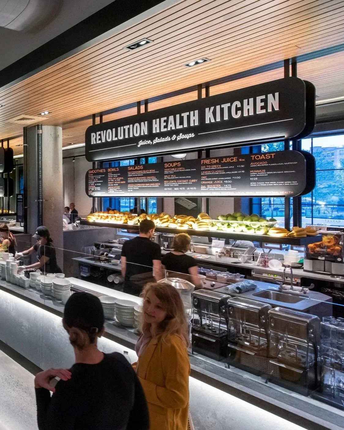
The first level takes about eight seconds per kiosk. During their first pass, guests wander through the food hall in exploration mode, scanning stall to stall. In roughly eight seconds per kiosk, they need to absorb the basic offering (what kind of food), a couple of highlights (a signature dish, a price cue, a visual hook), and enough personality to decide whether to keep walking or slow down.
The second level is more focused and intimate. Once the guest has narrowed down to one or two options, they slow down, step in closer, and want to study the individual menu items. Now they need small-type readability, clear pricing, and enough detail to make a decision.
The signage hierarchy in a food hall has to be designed with both levels in mind. Big, absorbable stall identity for the initial scan. Detailed, readable menu boards for the focused study. Most food halls get one right and the other wrong — either the signage is too dense to absorb in a walk-by, or it's too vague to make a decision once you've stopped. The best halls solve for both.
Menu height matters, too. Signage that requires guests to crane their neck or squint kills the experience. Comfortable eye-level positioning, high-contrast type, and a signage system that carries across the hall — those are non-negotiables in a good food hall design.
A quick note about digital menu boards: We love the functionality and ease of use of digital menu boards, but we shy away from them in our own halls for one simple reason — the aesthetic feels too much like a generic quick-service chain. The way digital menu boards are currently installed in most food halls — flashing food images, cheap-looking monitors mounted crookedly above the kiosk, wires hanging everywhere — is the antithesis of what a chef-driven food hall should feel like. So until this tech evolves to a point where it feels sophisticated, curated, and personality-driven, we've stuck to analog signage. But we're watching the category closely and open to it as the technology matures.
Create visual anchors and signature components
If the human-scale detailing is what makes guests want to stay, the visual anchors are what makes them come in the first place. A food hall needs monumental moments — features that go beyond what a guest could recreate at home, and beyond what a suburban food court could ever be.
Video: Go big or don't do it at all. We'd rather have a single twenty-foot video wall than a scattered array of six flat screens. One monumental installation reads as a design decision. Six flat screens reads as a Buffalo Wild Wings. Same rule applies to art — large-scale installations that command the room work far better than a smattering of smaller pieces spread across a wall.
The central bar as a signature. A large central bar with an illuminated back bar, or a dramatic circular bar in the middle of the room, is one of the fastest ways to differentiate a food hall from a food court. It creates a monumental visual anchor. It encourages guest interaction. It also does real economic work — a strong bar program can drive 20-30% of a food hall's revenue on its own, which we cover in more depth in our operator economics breakdown.
La Villita Food Hall, San Antonio
A stage as a communal anchor. Another key design signature for our food halls is a small stage — which we often back with a large video wall. This is a great way to provide a visual anchor for a large seating area and creates a natural home for live music, speaker series, cooking demos, or other activations. When not in use, the video screen can show sporting events or feature imagery of the vendor offerings. It's another element that differentiates a food hall from a food court — a food court has no reason to gather anyone around anything, and it shows.
Restrooms. Clean, safe, well-maintained restrooms are non-negotiable in a food hall — that's table stakes for guest experience and shouldn't need to be a design conversation. If the budget allows for a touch of design personality on top of that baseline, it's a nice moment guests will notice. But cleanliness and functionality come first; personality is the accent.
Define the vendor branding moments before vendors show up. Tell them exactly where their name, logo, and menu boards go. Define how they merchandise the kiosks. Don't leave any of this to their discretion. When we walk into a food hall and see scotch-taped, hand-printed menus, or ad-hoc pictures pinned to the wall, we know two things: nobody is managing the facility, and nobody thought about branding at the design phase. Vendors don't do this to be difficult — they do it because the space didn't provide the branding hooks they needed and they're improvising. That's a design failure, not a vendor failure.
Build for the life of the food hall — not opening day
The most common food hall design mistake we see in halls built five years ago and still operating today is that they were designed for the vendors and cuisine mix on opening day. Vendors change. Cuisine types evolve. What was a Thai place on day one might be a Korean-Mexican fusion on day 1,000. If the design can't accommodate that change, the hall stops evolving with its market and starts feeling dated.
The proscenium of each kiosk — the design surround that frames the vendor's space — should be neutral enough that any cuisine can occupy it. If you build a stall that looks like a strip-mall Chinese takeout on day one, you're going to be serving pizza inside it in twelve months and it's going to look ridiculous. Neutral proscenium, cuisine-specific personality inside. That's the rule.
Build the infrastructure for flexibility. Hoods, utilities, drains, water lines should all be sized for maximum changeability. You don't want to be re-plumbing the fire suppression system every time a vendor swaps out a piece of equipment. Over-spec the shared infrastructure — over the life of the hall, that decision pays back many times over in reduced retrofit costs and faster vendor turnover.
Consistent surrounds, personality moments. We recommend keeping the design surround of each kitchen the same throughout the hall — same proscenium, same lighting, same materials — and then providing defined moments (signage, menu boards, merchandising windows, artifacting areas) where the vendors can inject personality. This keeps the hall reading as one designed venue while still giving each vendor space to be themselves.
The technical foundation
Here's where we get into the specific numbers. These are the ratios and rules we apply to every food hall design engagement:
Seating: 26-32 seats per vendor kiosk. This is the single most under-programmed metric in most food hall designs. When guests visit a no-reservation food hall with many offerings, the operator has an obligation to guarantee they can find a seat. If a guest walks in twice with their tray of food and can't find a place to sit, they won't come back. We see operators shoot themselves in the foot with this mistake over and over. Under-programming the available seating is fatal to repeat visitation, and repeat visitation is the whole game.
Kitchens: 350 sf minimum per stall, with dedicated back-of-house refrigerated and dry storage per vendor. Kitchens smaller than 350 sf constrain menu, throughput, and vendor economics — and they make the kitchens hard to re-tenant when a vendor leaves. We've found that a kitchen this size allows for à la minute cooking and enough cold storage to get through a busy service. Any smaller and the vendor will run out of product halfway through a busy shift.

Chef at Le Fou Fou, Montreal
Cold kitchens: build with deliberate purpose, not by default - The number of cold kitchens (kitchens without hood infrastructure) in a food hall design is one of the most consequential decisions developers make — and one of the most misunderstood. Hot kiosks with full cooking capability are where the vast majority of food hall revenue is generated. Cold kitchens have their place, but only in specific contexts.
Time Out Market's Miami Beach location was designed with a roughly 50-50 cold-to-hot mix. Half the cold kitchens sat empty. The market couldn't support that many limited-format vendors, and the ones that did open couldn't hit revenue targets. It's the clearest data point we know for why the default assumption in food hall design should be majority hot (80% or higher in most halls), minority cold — with cold kitchens purpose-built for specific concepts the market actually wants.
Coffee is the cold kitchen decision that gets debated most. Some consultants have moved to blanket "don't include coffee" recommendations based on a handful of underperforming projects. We don't agree with that as a rule. Coffee vendors can and do work — in the right context. If the hall has real morning trade (dense residential, office workers commuting through, adjacencies like a medical center or select-service hotels driving early foot traffic), a coffee kiosk is a strong addition. Our Highlands Central Market project in Albuquerque is a good example: adjacent to a medical center and two select-service hotels, the morning trade will support coffee cleanly. In a suburban lifestyle-center hall with an 11 AM peak start? Skip coffee and use the stall for something with dinner economics.
The rule isn't "no coffee." The rule is: every cold kitchen has to earn its place through specific, defensible market logic. If you can't articulate why THIS cold kitchen works in THIS market, don't build it.
Don’t hide the cooking — never hide it. This is the biggest rookie design mistake we see. Ghost kitchens in the back with a service window at the front. Massive prep areas hidden away with only a pick-up station out front. It doesn't work. The difference between a chef-driven food hall and a ghost-kitchen delivery-app operation is that the food is made à la minute on restaurant-grade cooking equipment — you can see it being tossed in the pan, you catch a flash of flame, you see the cooks assembling the product. Guests want the excitement, the aromas, the theater of live cooking. We've seen beautifully designed food halls where the cooking was pushed to the back, and none of them worked. Design the kitchens for visibility.
Pre-build a place for beverages at every kiosk. This is often an afterthought — vendors add standalone coolers, ad-hoc displays, or pile bottled beverages on the counter, and it always looks a mess. We recommend small, guest-facing grab-and-go coolers built into the front kiosk counter, positioned in front of the point of sale. This creates impulse purchases, lets the vendor merchandise beverages and grab-and-go items cleanly, and eliminates the counter clutter that instantly makes a food hall feel like a food court.
Purpose-built bussing and trash stations. Design the busing stations with intent: a clear place for guests to dispose of food waste, a place for service trays and glassware, and enough visual order that the refuse station reads as intentional rather than accidental. We also build small utility cabinets into each bussing station for cleaning supplies, bar towels, and guest supplies like table wedges — so any staff member can quickly grab what they need to keep the space clean. In venues that use china rather than disposables, we build a two-tiered bussing setup that lets cleaners consolidate china and glassware into organized bus tubs, making dish room trips efficient rather than chaotic.
Circulation is a design deliverable. Guests need a clear pathway to explore the different cuisine offerings. A place to stand when queuing for an order. A pathway to pick up their food. And an easy way to navigate to a table with a tray of food and beverages. Circulation isn't something that emerges from the floor plan — it has to be intentionally designed, or the hall will feel congested at peak and dead at off-peak. Pinch points, bottlenecks, and confusing wayfinding are the invisible killers of guest experience.
Design is what turns a collection of vendors into a destination
Every developer we've worked with started the food hall design conversation focused on the wrong questions. How many stalls fit in this footprint? What's the RFR (rent-free rate) we can charge? How do we handle mechanical? Those questions matter, but they're operational — and operations follow design, not the other way around.
The right first question is: what kind of place are we building? A food hall is not a collection of vendors — it's a place that happens to contain vendors. When the design starts from that idea, every downstream decision (sizing, seating, signage, circulation, flexibility) gets easier because it's tethered to the frame. When the design starts from square footage available or rent-per-stall targets, the hall ends up as the sum of its individual leases — and that's exactly the food court trap.
The best food halls feel designed. Every seat feels considered. Every stall reads as part of a whole. Every visual moment — the bar, the stage, the video wall, the art — feels intentional. Guests can't always articulate why one hall works and another doesn't, but they know it in the first thirty seconds of walking in.
If you're planning a food hall project and want an operator's read on the design decisions ahead of you, our food hall consultant services practice does exactly this work — from early feasibility through design review through vendor curation. And if you're still deciding whether the project pencils in your market, our Halo Effect breakdown walks through the underwriting framework.
Frequently Asked Questions
-
The most important difference is intent. A food hall is designed as a cohesive destination — a single coherent dining experience that happens to contain multiple vendors, with a visual throughline that binds the space together, elevated finishes, variety in seating, and monumental design moments (bar, stage, art) that guests can't recreate at home. A food court is designed as a collection of individual tenant spaces sharing a common seating area, with signage optimized for competing attention rather than shared identity, and furniture engineered for turnover rather than dwell time. The gap between the two is nearly always a gap in design intent, not budget.
-
There is no universal ideal size — the right size for a food hall is determined by the trade area's transaction capacity, not the available square footage. We start with realistic trade-area capture, average check, and viable vendor economics, then size the hall to what the market can actually sustain. As a general rule, we don't consider anything under 8-10 vendor offerings for a full-service food hall, but we're equally cautious about oversizing. A hall that feels empty at peak is worse than a smaller hall that feels full.
-
We design for 26-32 seats per vendor kiosk. In a 10-vendor hall, that's 260-320 seats. Under-programming seating is the most common design mistake in food halls — when guests can't find a seat with their tray of food, they don't come back. Repeat visitation is the whole business, so seating capacity has to be generous.
-
We recommend a minimum of 350 square feet per kitchen stall, with dedicated back-of-house refrigerated and dry storage. Smaller kitchens constrain vendor menus, limit throughput, and make it harder to re-tenant when a vendor leaves.
-
Almost always, yes. A dramatic central bar with a strong beverage program is one of the highest-ROI design decisions in a food hall. It creates a monumental visual anchor, encourages guest interaction, extends dwell time, and can drive 20-30% of the hall's total revenue with much higher margins than the food kiosks. Halls without a real bar program consistently underperform halls that treat the bar as a signature.
-
It depends entirely on the trade area. Coffee vendors need real morning volume to be economically viable — dense residential, office workers commuting through, or adjacencies like a medical center or select-service hotels that drive early foot traffic. In those contexts, coffee is a strong addition and often a signature. In a suburban lifestyle-center hall with an 11 AM peak start, coffee will struggle. The rule isn't "no coffee" — it's that every cold kitchen has to earn its place through specific market logic.
-
Maximum flexibility. Vendors change, cuisine types evolve, and equipment needs shift over the life of the hall. Build the shared infrastructure (hoods, utilities, drains, water lines) for the largest reasonable use case. Design the vendor fronts to be neutral enough that any cuisine can occupy them. Over-spec the infrastructure at construction and you save meaningful money over the life of the hall on retrofits and vendor turnover.
-
Yes — as much as possible. Visible cooking is one of the primary differentiators between a real food hall and a ghost-kitchen operation. Guests want to see the flash of flame, catch the aromas, watch the assembly. Kitchens designed with cooking pushed to the back of house consistently underperform. Design for visibility from the guest side, always.